Thursday, 5 June 2014

Enchanted


Consider how Disney subverts the conventions of the classic Fairy Tale im the film "Enchanted"

Q1. Note references to other films;
Cinderella- the slipper left at the end, the ball, the evil stepmother, she falls asleep and is awoken by the true loves kiss, the deadline at 12oclock.
Snow White- She knows the 7 dwarfs, the poisinous apples, the evil old lady, all the animals help her get ready.
Sound Of Music- she runs up the hill singing and dancing.
Sleeping Beauty- he kisses her at the end and then she comes back to life.

Q2. The opening sequence is animated and contains the features of a classic fairy tale- why?
To show it is actually a classic fairy tale but with a twist to bring the audience in and make them unsure on whats going to happen and real them in and make them think.

Q3. How does Disney introduce modern day America?
When the character falls down the wishing well and then comes out of the drains in the modern day, busy, unhelpful, rude and dangerous America.

Q4. How does the audience's reaction to Gizelle within the film portray society's reaction to the unusual?
It suggests you are judged for what you do and get judged for being different, which also in todays society.

Q5. Consider the roles of gender within the film- who has the power?
Throughout the film different people have the power, at first the prince has the power because he marrys Gizelle, then the evil queen has the power because she pushes Gizelle down the wishing well, then the man who looks after Gizelle has the power his name is Robert and he resues Gizelle then finally Gizelle has the power because he rescues Robert.

Q6. How does the conclusion of the film link to the classic fairy tale?
There is a happy ending, the shoe fits Nancy at the end, Robert kisses Gizelle and she then wakes up, the evil old lady makes Gizelle eat a posionous apple, there is an evil dragon that takes Robert away amd finally there is a big ball at the end.

Friday, 25 April 2014

Codes and Conventions of DVD covers


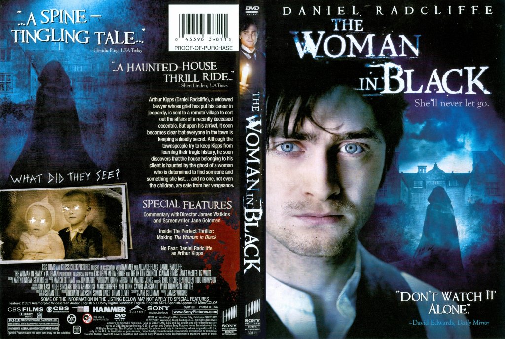
The Woman in Black
Front; The first thing that catches the audiences eye is the actor at the front. He is looking straight ahead to the audience to make them think why his eyes and face looks in pain. Behind the main actor there is a screen grab of the town with houses in the background. In front of the houses there is a black figure which looks ghostly which suggests they will come and haunt the main actor at the front that looks terrified. At the top of the cover there is only one actors name which is "Daniel Radcliffe." He is known for being in a superstitious film, which are normally fantasy/horror or action. As we know this we are not surprised he is in this film with ghosts and fantasy characters. The tag line  "She'll never let go." which suggests the ghosts and fantasy characters are going to follow the other characters during the whole film and also gives the impression they want to hold onto someone. There is a rating at the bottom of the cover that is from the daily mirror and shows the audience that the film has been reviewed from a professional prospective.The font and the colour for the title is very effective in my opinion, because the font is smudged and rigged which suggests unexpected moments and suspense. The colours overall on the cover are dull colours (reds, dark blues and blacks) which makes the audience immediately think its a horror.


Back; The first thing that catches the audiences eye is a brown old coloured screen grab at the bottom corner. The image is of two children and both of their eyes have been scratched out. At the top of the screen grab it says "what did they say?" this suggests they have seen something horrific and something the audience could see throughout the film. At the top there is two ratings from a website and a newspaper. This shows the film has been reviewed and when the audience see what they think they want to see why they said it. For example "A spine - tingling tale" the audience would want to know why its scary and is a good use of a exaggerated phrase/ metaphor. In the middle there are special features that come with the DVD. This DVD has added special features because they have competition with other companies that let people watch films online for free. By adding special features this gives a reason for the audience to buy the film so they can see extra parts and see what the actors opinions are. The image at the top is a repeat of the black figure. Although it looks the same image the house behind the figure is in front of a different house. This suggests the black figure is on the run again and wont let the victims run or hide.


Wednesday, 2 April 2014

Evaluation- Dvd poster


Evaluation
This is my DVD poster for my horror trailer. It is advertising my film. It says how the film will be out in cinemas soon. The title is red which represents blood and is associated with danger and power. The main character (in the picture) is powerful and dangerous with her weapon(knife). The rest of the writing is white which represents innocence and purity. The people who the main character is going to get are innocent. In the caption the word 'hide' is red (a different colour) to the rest of the caption, it is also a bit bigger.The picture is a mid shot and is a high angle shot which shows the knife more.She is holding the knife in an awkward, abnormal position to get the audience involved and thinking about it. The picture is zoomed in which emphasizes her scary look and her weapon/knife. There are 5 golden/yellow stars which are the ratings, we have given our trailer. We have a review at the bottom from Total Film magazine, it brings the audience in and lets them know how good or bad the film is, from a professional point of view. In the corner there is a 15 certificate rating.It is a thriller and is too scary and gory to be a 12 rating but is not scary or gory enough to be a 18 rating. This poster will advertise our film until the next poster comes out and shows the exact dates and more information nearer to the release date of the film.